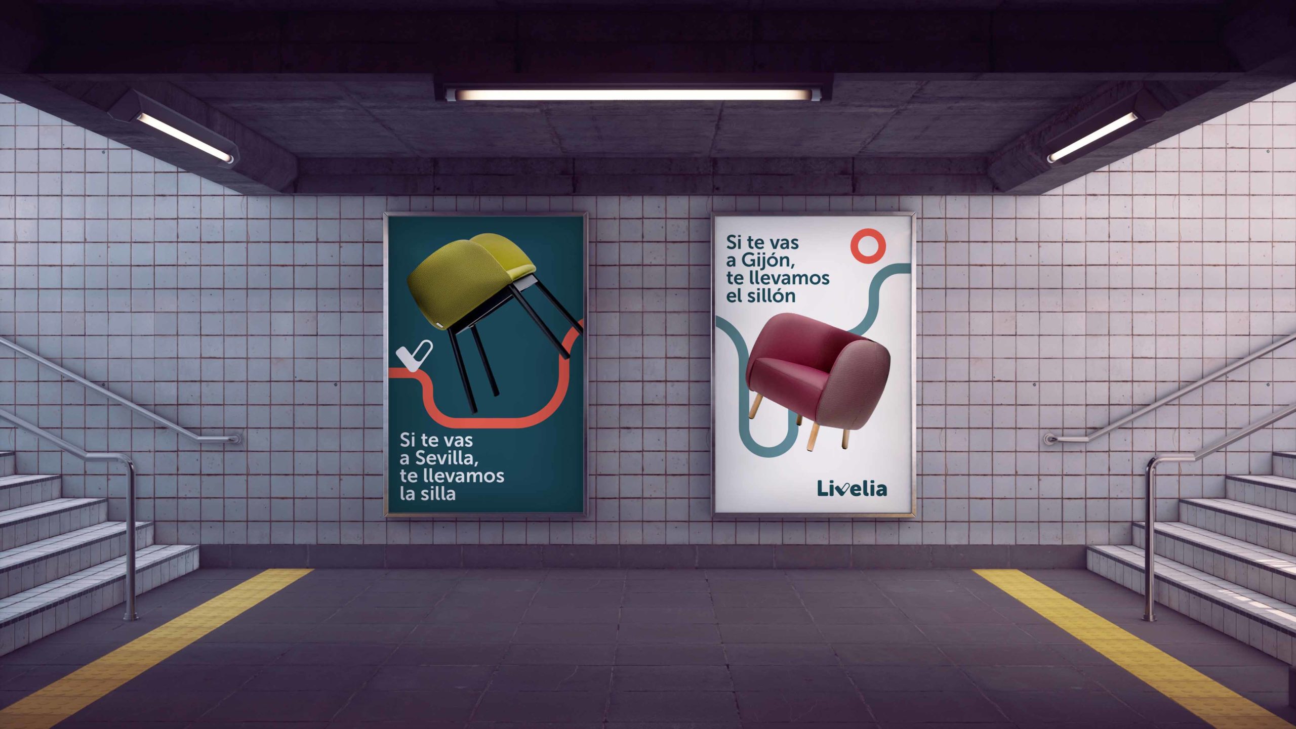
Branding
Naming
Livelia
A brand to feel at home
Livelia is a furniture and decoration marketplace that unites Spanish manufacturers and stores. Its differential factor is the service and the wide variety of styles you can find, a place where the user is comfortable and at ease with the purchasing process, and products that represent them. Based on this business proposal, we created a brand that revolves around the feeling of "being at home", which is transmitted to each of the parts that surround the process of purchasing household items.
Livelia is a neologism of “live", a word that is part of the most important area of a house, the livingroom. Combined with the suffix "-lia", we adapted the name to its Spanish reading and achieved a soft and symmetrical sonority.
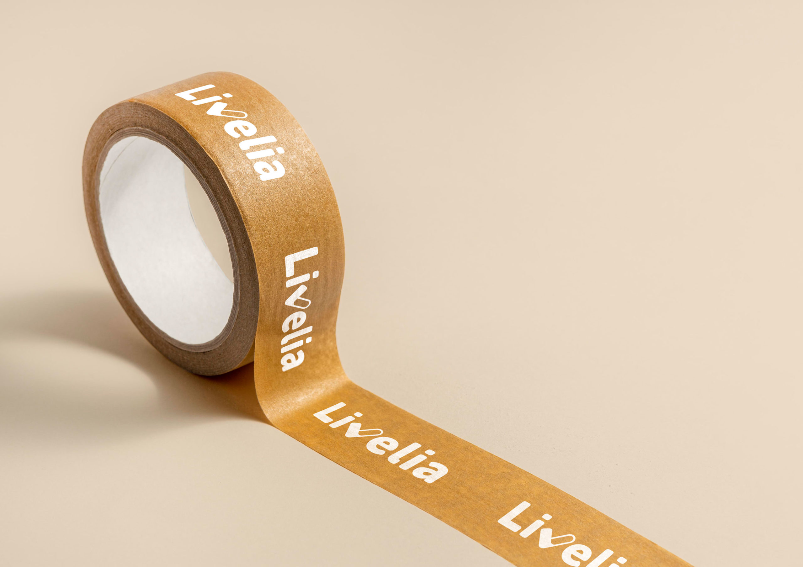
The logo takes a padded, friendly shape, with the distinctive "v" sign in the shape of a "check" and a heart.
Created for all audiences and devices
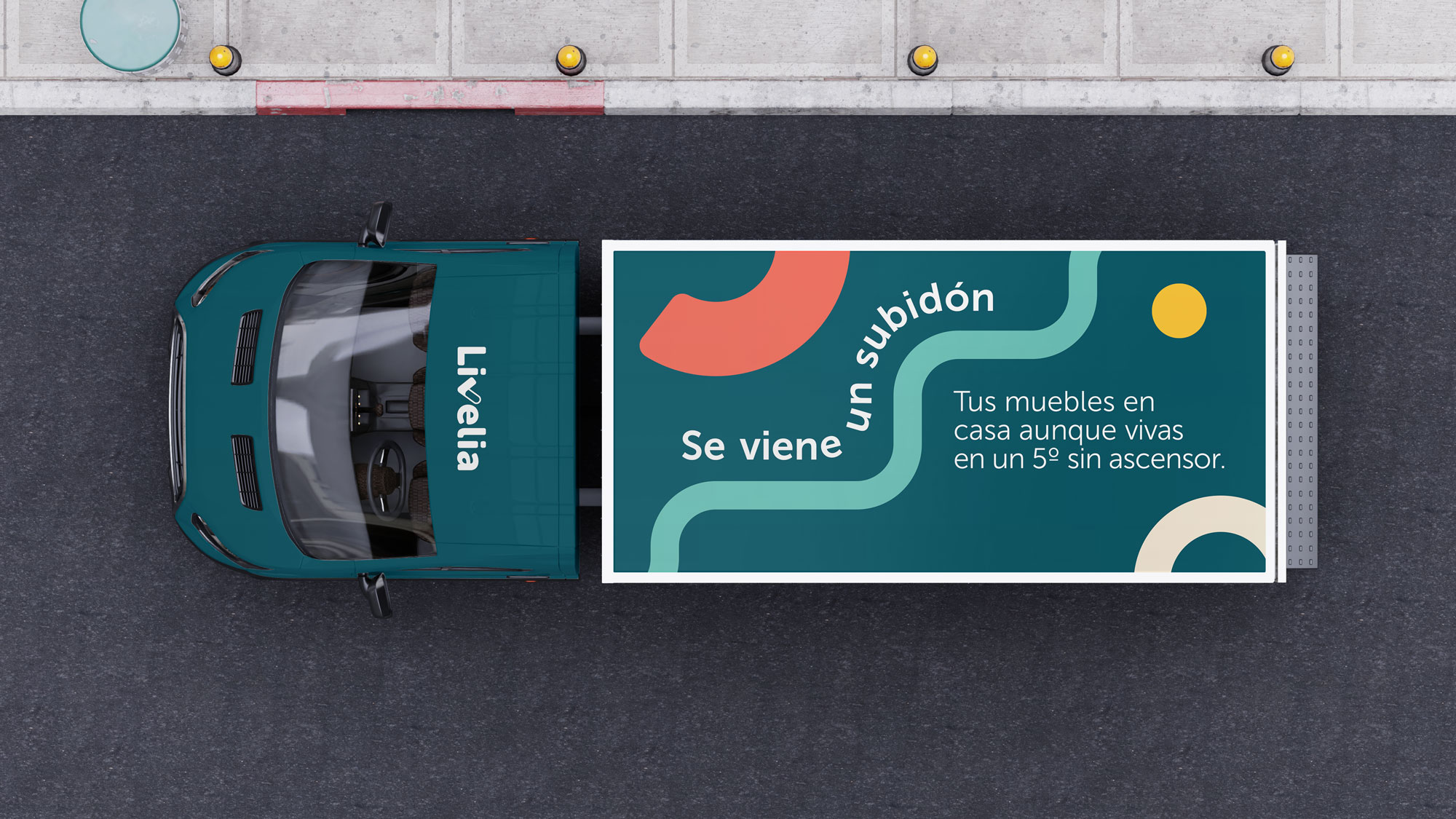
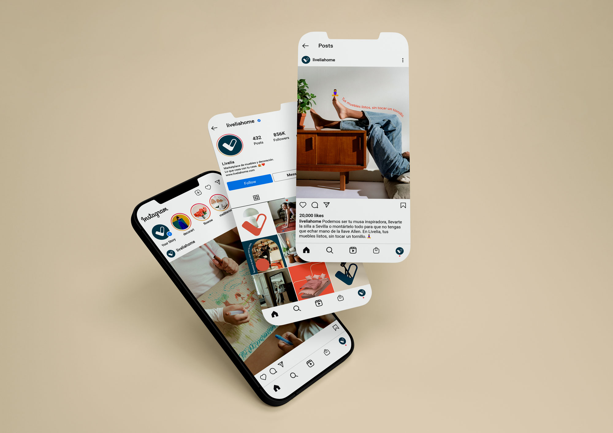
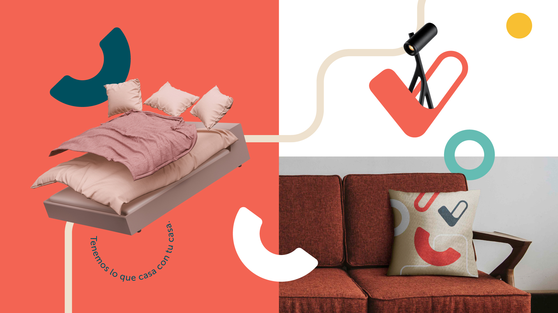
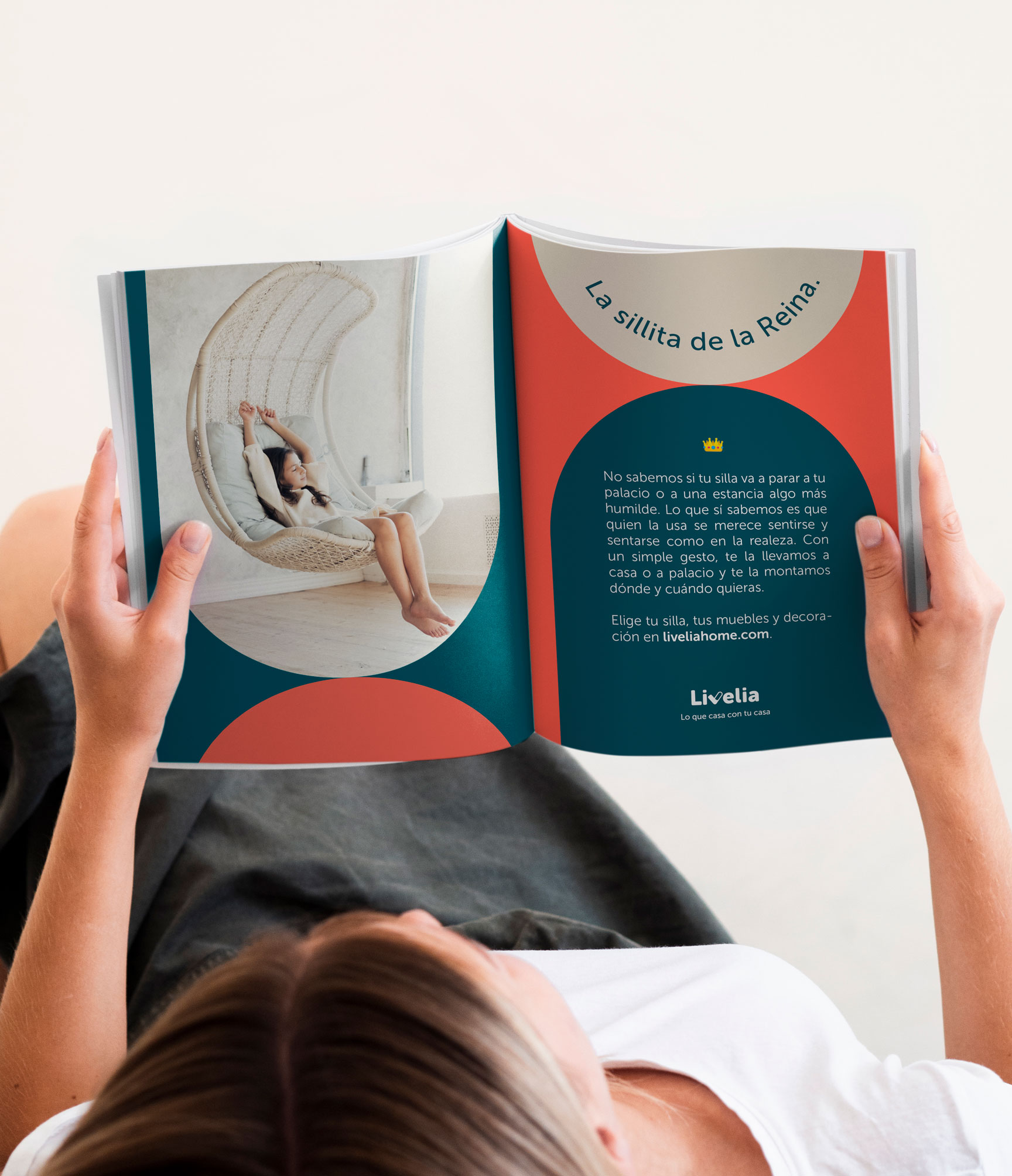
From the shapes of the logo and the calligrams, we created a casual visual universe for a mainstream target. The color palette, accessible, is specially designed for the digital product.
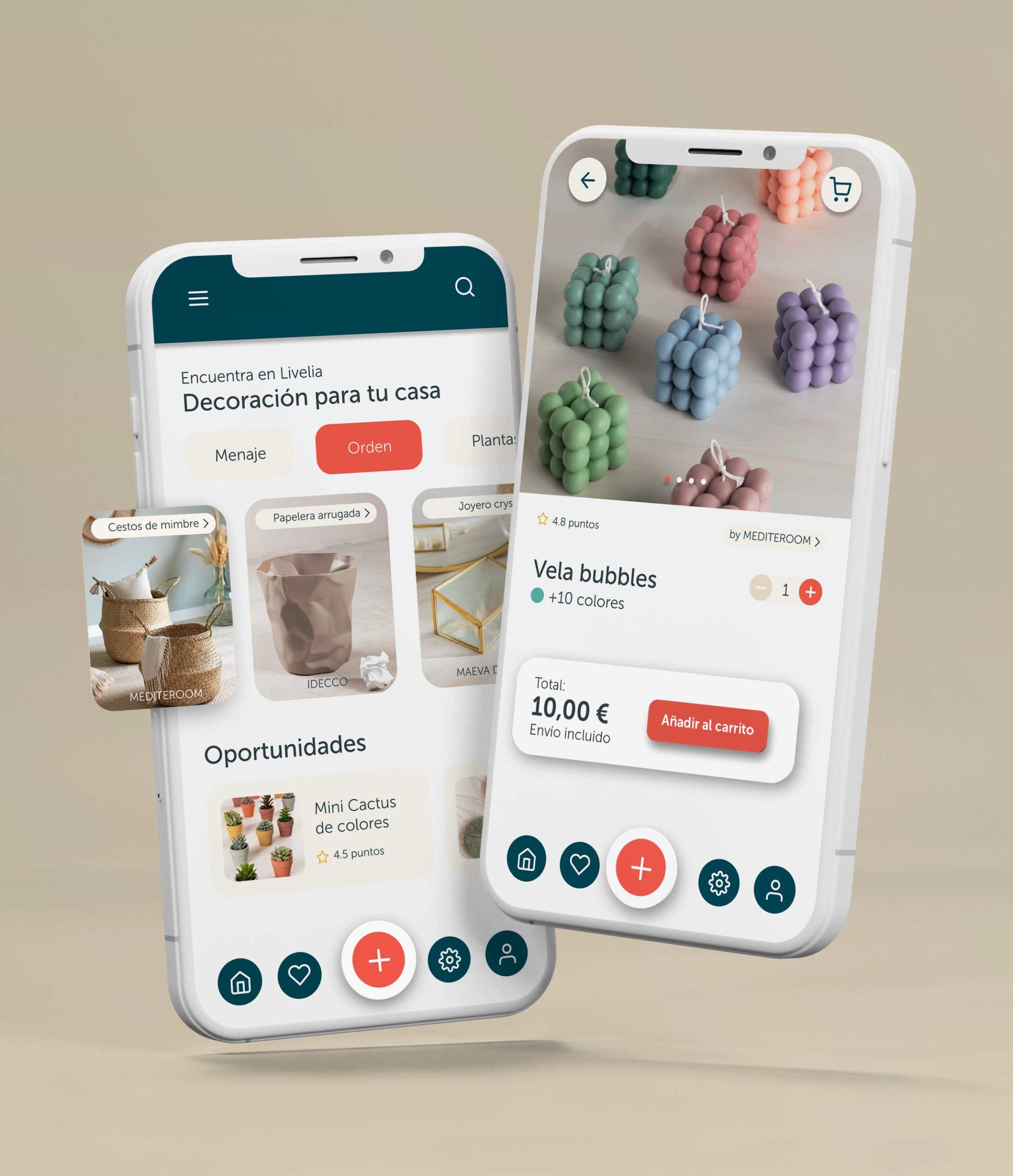
This strong digital component has its maximum expression in the movement, floatage and fluidity of the motion system. The shapes and calligrams in action also feel at home, having fun and settling into the space.
The voice of Livelia
One of the differentiating elements of this brand is its verbal identity. Livelia has a personal and playful voice. It experiments with words and avoids boring or default phrases. At all times it shows its helpful side, elevating the user to the category of queen, prince or princess. A voice and a tone that are represented in the claim “Lo que casa con tu casa”.
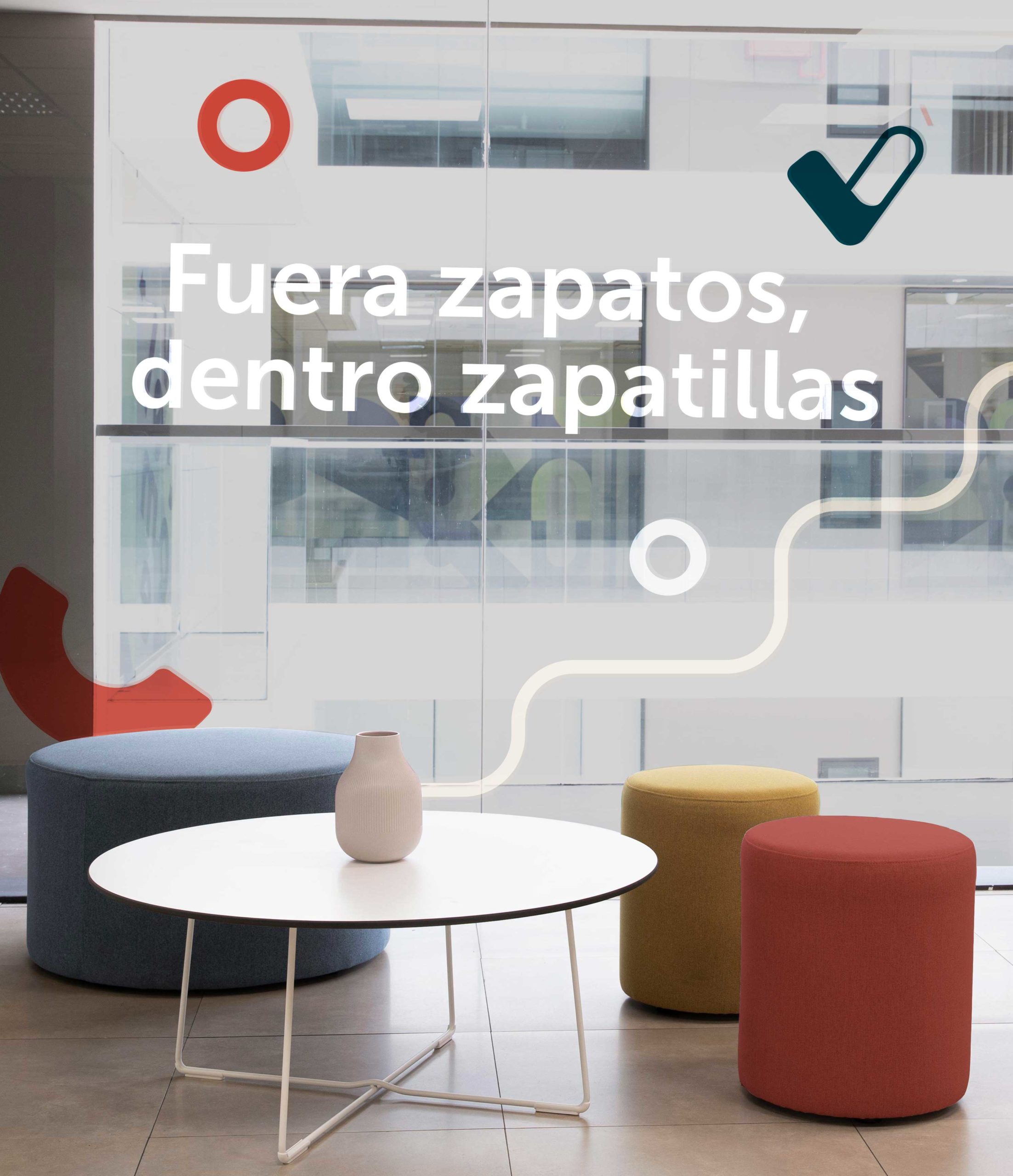

In order that Livelia's brand can be easily applied by any professional, whether from the digital product team, marketing or investors, an online brand manual was created. In it you can find indications for the correct use of the brand, inspiration and downloadable materials that are needed.
